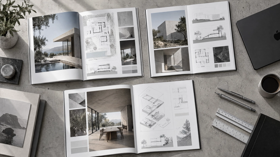
Architecture Presentation Boards: Layouts, Tips and Examples
How to structure an architecture presentation board: key elements, grid layout, reading order, and how it differs from an interior design board.

An architecture presentation board is a single visual panel, physical or digital, that summarizes a design idea for a client, a jury, or a studio crit. Good ones lead with a strong image, keep text minimal, and walk the eye through the project in a clear order. A cluttered one leaves a rushed impression no matter how good the underlying work is. This guide covers what to include, how to lay it out, and where interior design boards differ from architecture ones.
What Is an Architecture Presentation Board?
An architecture presentation board is a curated layout of renderings, plans, and a short concept statement, built to communicate a design in one glance. It's not a portfolio page and it's not a technical drawing set. It's a translation of both into something a non-technical audience can read in under a minute.
The board's job is to support your spoken pitch, not replace it. If someone has to read three paragraphs to understand the project, the layout has failed.
Key Elements of a Presentation Board
Crafting a strong presentation board starts with the same short list of design elements every time. What changes is the mix.
A Dominant Rendering
Pick one image and let it lead. A single high-quality rendering, usually 20 to 30 percent of the board's area, should capture attention before anyone reads a word.
Plans, Sections, and Diagrams
Plans and sections carry the technical details a rendering can't. Keep every plan in the same orientation, with north pointing the same direction across the board, so the drawings read as one connected story instead of separate fragments.
A Concept Statement
One or two sentences that capture your overall vision for the project. This is the line a juror repeats back to you, so make it specific to the design concept, not a generic mission statement. Getting the client's vision right here is one of the most important elements of the whole board.
Materials and Color Palette
A small swatch strip showing the wood, glass, and finish materials grounds the renderings in something tactile. Stick to a limited color palette, two or three tones plus a neutral, a small commitment that keeps the board reading as cohesive rather than busy.
Site Context
A location map or massing diagram helps define the "why here" before the "what." Even a simple site plan links directly to the concept statement and supports the rest of the story.
How to Lay Out an Architecture Presentation Board
Layout is where most boards fall apart, usually from cramming too much into too little space.
Start With a Grid
A grid structure is the fastest way of organizing a board so it doesn't look like a collage. Set consistent margins and column widths before you place a single image, then let every element snap to that structure. Alignment across panels, plans that line up with the renderings above them, is what separates a board that looks intentional from one that looks assembled in a rush.
Establish a Visual Hierarchy
Not every element deserves equal weight. Your hero rendering should be the largest object on the board. Plans and diagrams come next in size. Text sits smallest, in a supporting role. This hierarchy is what lets someone scan the board in five seconds and still walk away with the gist.
Balance Text and Visuals
Keep the words to a minimum. A concept statement, a few callouts, and labels for your plans are usually enough. If you're explaining a decision in a full paragraph, that explanation probably belongs in your verbal presentation, not the board.
Follow a Reading Order
Boards read left to right and top to bottom, the same as a page. Design your layout so the story flows that way: site context first, then concept, then the supporting plans and renderings, then details. Generous white space around each grouping keeps the eye moving instead of getting stuck.
Design for Multiple Viewing Distances
A board gets seen up close during a one-on-one review and from across the room during a pin-up. Your title and hero image need to read from ten feet away; your plan labels and material callouts can be smaller, meant for someone standing right in front of the panel.
Digital vs. Physical Boards
Physical boards still show up at pin-up crits and in-person client meetings, printed on foam core or mounted card. They hold up well for tactile reviews where people walk the room.
Digital boards, built as a PDF, a slide, or an image file, are now the default for remote presentations and portfolio platforms, where a client can explore a project at their own pace. The format doesn't change the fundamentals: the same grid, hierarchy, and reading order apply either way. Some digital formats support interactive elements, like clickable plan call-outs or embedded video walkthroughs, which a printed board can't offer, one of the real benefits of going digital.
Good boards adapt easily between formats. Pick the one based on the room you're presenting to, not the other way around.
Presentation Board Ideas by Project Stage
The right layout depends on the nature of the project, what stage it's at, and what story you need to tell effectively.
Concept and Schematic Boards
Early-stage boards lean on diagrams: massing studies, bubble diagrams, and a rough site plan. The goal is to demonstrate direction, not finished detail. One strong concept sketch can carry more weight here than a polished rendering.
Design Development Boards
At this stage, plans and sections get more precise and renderings start to show real materials and lighting conditions. This is where a board earns its "technical" reputation, mixing measured drawings with visuals that are close to final.
Portfolio and Competition Boards
These boards need to work without you standing next to them. Every label, every callout, has to explain itself. Architects who present designs to competition juries know panels get scanned in seconds, so a clear hierarchy and a strong cover image matter more here than almost anywhere else.
Interior Design Presentation Boards vs. Architecture Boards
Interior designers and architects share the same layout principles, grid, hierarchy, limited palette, but the content differs.
An interior design presentation board leans harder on materials: fabric swatches, finish samples, furniture selections, and lighting fixtures sit alongside the renderings. Architecture boards spend more of their space on plans, sections, and massing.
Interior designers also work more often with a dedicated mood board earlier in the process, a separate document that establishes the design concept and palette before the full presentation board gets built. Architects tend to fold that step into the concept statement on the main board itself.
Both fields answer to client expectations in the end. The board exists to manage those expectations by showing, not just describing, what the finished space or building will look like.
Tools for Building the Board
Layout software handles the composition. Adobe InDesign and Photoshop remain the standard for firms whose staff have the design expertise to use their grid and typography features well. Canva and Microsoft PowerPoint or Pages can produce a clean board with less of a learning curve for teams that don't need that level of control.
For the renderings themselves, most firms still lean on traditional visualization software, tools like Chaos V-Ray and Enscape, for final, high-fidelity images. Chaos's 2025 State of Archviz report found that 52% of visualization professionals now work in a hybrid environment, mixing real-time engines with traditional rendering, and that 43% cite slow render times as a top pain point in that workflow.
AI rendering tools are increasingly used for early-stage and concept visuals. The same Chaos report found 44% of designers already use AI to generate concept images.
FORMAS.AI is one option in that category. It's a platform that orchestrates 50 or more specialist AI models to turn a sketch, a massing model, or a text prompt into a rendering you can drop onto a board. It didn't train its own foundation model, it routes your input to the models suited to the job. It imports GLB, GLTF, OBJ, FBX, STL, Rhino 3DM, and PDF files, so you can bring in a massing study from whatever software you already model in.
Worth being clear about what FORMAS.AI does and doesn't do: it generates the imagery that goes on the board. It doesn't lay out the board itself, there's no built-in template library or board-composition tool. You'll still bring the rendering into InDesign, PowerPoint, or Canva to build the actual panel. Signup gets you 500 free credits, then 50 a month on the free tier, which is more room to start than V-Ray or Enscape give you, since neither offers a free plan and both require a paid license from day one. Paid plans start at $19 a month, with a $19.90 student rate, and 3D model saves are capped by plan, from 3 on the entry paid tier up to 20 on the top plan.
If a client meeting or crit is tomorrow and you still need a hero image, that's the gap AI rendering tools are built to close, not the layout itself.
Common Mistakes to Avoid
Overcrowding the board. If you're debating whether to cut an element, cut it. A board with breathing room reads better than one that fits more information.
Inconsistent plan orientation. Every plan needs the same north point and the same scale relationship to the others on the board, or the drawings stop reading as one project.
Burying the concept. If a reviewer can't find your one-sentence concept statement in the first five seconds, move it.
Mismatched color treatment. Renderings with wildly different lighting or color grading break the cohesive feel a limited palette is supposed to create.
Text-heavy captions. A caption should label, not explain. Save the explanation for your voice.
Key Takeaways
- Lead with one strong rendering and build the hierarchy around it.
- Use a grid to keep plans, renderings, and text aligned.
- Keep text minimal: a concept statement, labels, and callouts are usually enough.
- Interior design boards lean on materials and FF&E; architecture boards lean on plans and sections.
- AI rendering tools like FORMAS.AI can generate the hero image for a board; you still lay out the board yourself.
Next Steps
Sketch a rough thumbnail of your layout before you open any software. Confirm your grid and hierarchy on paper, then build the real board once the structure is settled. It's a lot faster to move boxes around on a napkin than to redo a finished InDesign file.
FAQ
What is the board called that interior designers use?
Interior designers typically call their early-stage panel a mood board. It shows colors, materials, and inspiration images that establish the design concept before the more detailed presentation board gets built.
How much do designers charge for a mood board?
Rates vary widely. Some designers charge hourly, often in the $50 to $200 range, while others charge a flat fee, commonly $200 to $500 per room. Many fold the mood board into their overall design fee instead of billing it separately.
What are the 7 key elements of interior design?
Space, color, texture, line, form, pattern, and lighting. These elements work together, and a presentation board's material swatches and renderings exist to demonstrate how they'll play out in the finished space.
How do you design a presentation board?
Start with a grid, pick one dominant image, and build a hierarchy around it. Add plans, a concept statement, and a materials palette, then check that the layout reads left to right, top to bottom, before you finalize it.
Can you give examples of presentation boards?
Common examples include a schematic concept board built around a single diagram, a design development board mixing plans with near-final renderings, and a portfolio or competition board designed to explain itself without a presenter in the room.
What are some good presentation board ideas?
Anchor the board around one hero rendering, keep the palette to two or three colors, and use a grid to align every plan and callout. For interior projects, add fabric and finish swatches next to the renderings.
What are the different types of presentation boards?
Concept boards, design development boards, and portfolio or competition boards are the main types in architecture. Interior design adds the mood board as an earlier, separate step focused on materials and palette.
How do you creatively present a presentation board?
Give it a clear narrative arc: site and context first, concept next, then supporting plans and details. A strong cover image and a consistent color treatment across every panel go further than any single clever effect.